7 Homepage Mistakes That Are Quietly Costing You Clients (And How to Fix Them)
Your homepage has one job: make the right person feel like they’re in exactly the right place.
If something feels slightly off about your site — you hesitate before sharing the link, inquiries come in that aren’t quite aligned, or you just sense it no longer reflects where your business is now — your homepage is almost always where the disconnect starts.
After working with photographers and creative business owners on their Showit websites, I’ve seen the same patterns show up again and again. These aren’t dramatic failures. They’re quiet misalignments that slowly erode trust and conversions.
Here are seven of the most common ones, and the simple shifts that make a real difference.
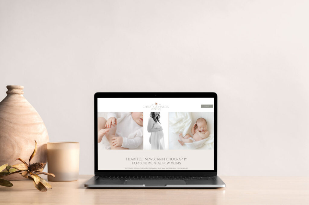
1. No Clear First Impression
When someone lands on your homepage, they decide within seconds whether they’re in the right place.
If your headline is vague, overly poetic, or trying too hard to sound clever, it creates confusion — and confused visitors leave.
Your headline doesn’t need to say everything. It needs to say the right things: what you do, who you serve, and why it matters to them.
The fix: Read your headline out loud and ask yourself — if someone knew nothing about my business, would they immediately understand what I offer? If not, simplify it. Clarity always outperforms clever.
2. It’s All About You, Not Them
Your story matters. Your process matters. But here’s the thing — when someone lands on your site for the first time, they’re not thinking about you yet. They’re thinking about themselves.
Is this for me? Do I connect with this style? Can I see myself here?
If your homepage leads with your background and journey without first reflecting your client’s experience back to them, there’s a disconnect — even if everything looks beautiful.
The fix: Lead with your client. Speak to what they’re looking for, how they want to feel, and what they value. Then let your story come in as the reason you’re the right person to help them get there.
3. No Clear Next Step
A stunning website without direction is like a beautiful shop with no signage. People wander, feel uncertain, and quietly leave.
Your homepage should guide your visitor forward — not in a pushy way, but with enough clarity that the next step feels obvious and easy.
The fix: Make sure every section of your homepage has a purpose, and that there’s a clear, natural path from arrival to action. Whether that’s exploring your portfolio, learning about your process, or reaching out to inquire — the route should never require effort to find.
4. Too Much Clutter
Homepages tend to accumulate over time. A new section here, an extra image there, a little more copy — and suddenly the page feels heavy and overwhelming.
When everything competes for attention, nothing lands.
The fix: Edit ruthlessly. Choose your strongest images. Trim your copy. Give each section room to breathe. A clean, considered layout doesn’t just look better — it feels better to move through, and that feeling is what keeps people on your site.
5. It Reflects an Old Version of Your Business
Your business has evolved. Your website should too.
Maybe your style has refined. Maybe you’re attracting a different type of client than you were two years ago. Maybe your pricing, packages, or focus has shifted. If your website still reflects where you were — not where you are — there’s a quiet disconnect that visitors can sense, even if they can’t name it.
This is often why things start to feel slightly off. You hesitate to share your link. The inquiries coming in don’t feel quite right. The site no longer feels like you.
The fix: You don’t always need a full redesign. Sometimes it’s targeted, intentional updates — new imagery, refined messaging, a layout that better reflects your current direction. When your website catches up to your business, everything starts to feel natural again.
6. Your Mobile Experience Is an Afterthought
Most of your visitors are on their phones. Not occasionally — most of the time.
And yet so many beautiful websites fall apart on mobile. Text runs too long, buttons are hard to tap, images lose their impact, and sections that felt balanced on desktop suddenly feel cramped or disconnected.
It creates just enough friction to lose someone.
The fix: Your mobile experience deserves the same intentionality as your desktop version. This is actually one of the reasons I build exclusively on Showit — it lets you design your mobile layout independently, so you’re crafting a deliberate experience rather than hoping an auto-generated version does the job. On mobile, easy and calm wins every time.
7. There’s No Social Proof
When someone lands on your website, there’s a quiet question running in the background: Can I trust this person?
If your homepage doesn’t answer that — even subtly — it creates hesitation. And hesitation is where decisions stall.
Social proof doesn’t need to be flashy. It just needs to be there.
The fix: Add one or two short, genuine client quotes to your homepage. A few words about what the experience felt like. Maybe a simple line about how many clients you’ve worked with. These small details shift someone from “this looks nice” to “this feels right” — and that’s the moment conversion actually happens.
Is Your Homepage Working As Hard As It Should Be?
If you’re nodding along to a few of these, you’re not alone. Most websites are built at one stage of a business and quietly left behind as things evolve. The misalignments are rarely dramatic — they’re subtle. But they add up.
The good news? You don’t have to start over.
Not sure where to begin? Grab the free Website Refresh Checklist — a simple, focused resource to help you identify exactly what’s working on your site and what needs a few intentional updates.
Ready for hands-on support? The Design Edit is my focused, strategic service for creative business owners who want their website brought back into alignment — without a full redesign. We look at your messaging, layout, and overall flow and make targeted updates that actually move the needle.
Your website should feel like the best, most current version of your business. If it doesn’t, let’s change that. Let’s Chat

